How to use and feature-detect CSS grid masonry layout
- Published at
- Updated at
- Reading time
- 5min
The very new CSS grid masonry layout functionality coming with CSS grid will ship in browsers eventually.
This post shares what you need to do to get started and implement masonry layout in your sites, and it explains feature detection in CSS and JavaScript. It's not going into the nighty-gritty details of masonry grid layouts. If you want to dive into the topic, find additional resources at the end of the article.
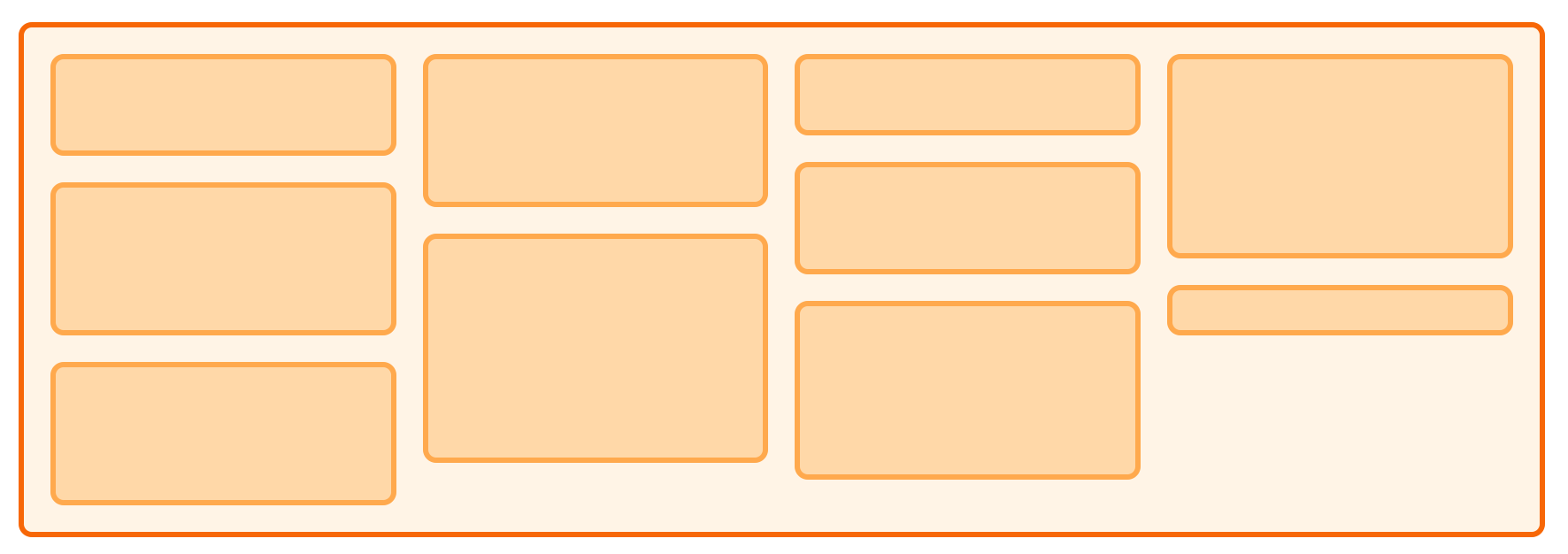
That's my site's implementation for browsers that do or don't support the new masonry grid layout.

On the left, you see a standard CSS grid layout. Unfortunately, the content in the grid has one problem. The included sections and areas substantially vary in height. Some elements hold only a few entries whereas others include more than thirty entries. Having these sections next to each other in a grid leads to a lot of empty whitespace. That's why I manually adjusted particular cells to span over multiple columns.
For example, the area for CSS spans over three rows using grid-row: auto/span 3. Similar to most manual adjustments, this is far away from being perfect.
.area-css {
  grid-row: auto/span 3;
}
In these situations the masonry grid layout comes into play and shines. It enables you to make the best out of all the available space without manual adjustments. 🎉
One the right, the elements for each area are automatically readjusting depending on their height. The grid is laid out automatically. It's beautiful!
The masonry grid is based on CSS similar to the snippet you find in the MDN documentation for CSS grid with Masonry.
.container {
  display: grid;
  gap: 10px;
  grid-template-columns: repeat(auto-fill, minmax(120px, 1fr));
  grid-template-rows: masonry;
}
The code above leads to a grid similar to my site and the one below.
First things, first. At the time of writing, there's no cross-browser support for masonry grid layout. When you're looking at caniuse.com for the masonry layout, you'll find out that there's no browser at all. No browser is shipping masonry layouts, and it's only Firefox rushing ahead with an implementation behind a flag.

To get started, open Firefox and open about:config (you can type it into the URL bar) and enable the boolean flag for layout.

Once you enabled masonry grid layout, head over to my TIL overview. A celebration message, confetti and the masonry grid layout spanning the whole page will greet you.

There's one critical fact about web platform feature adoption. You can't just throw new and only partially supported features into your CSS and call it a day. You always have to consider a fallback behaviour.
Is the new feature degrading gracefully? Does everything still work when the browser doesn't support it? Is the new web platform feature mission-critical or is just fine, if it doesn't work?
These questions are essential to guarantee a good user experience, and that's why my site includes feature detection in CSS and JavaScript to define a fallback behaviour.
Feature detection in CSS
To check if a browser supports a new CSS feature, leverage the @supports feature query. Use the feature query with the CSS declaration you want to test and apply your CSS if a browser does or does not support the new CSS feature.
I added a new class (list-masonry) to my code base that should apply the masonry grid layout if the browser supports it.
/* define list-masonry if the browser support Masonry */
@supports (grid-template-rows: masonry) {
  .list-masonry {
    list-style: none;
    margin: 0;
    padding: 0;
    display: grid;
    grid-gap: var(--grid-gap);
    grid-template-columns: repeat(auto-fill, minmax(16em, 1fr));
    grid-template-rows: masonry;
  }
}
Additionally, to hide and show the celebration message, I added a new utility class. The class works similar to classes such as hide-on-small that hide elements depending on viewport sizes.
The difference to viewport dependent classes is that show-if-supports-masonry doesn't rely on a media query but a feature query.
show-if-supports-masonry initially sets the element's display property to none. If a browser supports masonry layout, the feature query overwrites the "hiding CSS" with display: block.
/* hide element initially */
.show-if-supports-masonry {
  display: none;
}

/* show elements if the browser support masonry layout */
@supports (grid-template-rows: masonry) {
  .show-if-supports-masonry {
    display: block;
  }
}
Paired with the following HTML, I can show a celebration message depending on the browser feature support.
<div class="show-if-supports-masonry">
   🎉 Looks like your browser supports masonry grid layout... Cool beans! 🎉
</div>
Features detection in JavaScript
So far, I applied the masonry grid layout and showed a nifty message when it was supported. But I wanted to celebrate the early adopters even more!
The people who are browsing my site and maybe even subscribed to my newsletter might know that I have confetti canons in several areas on my site.
Little quick trick: You can add confetti to your site without any tooling by leveraging skypack. Skypack is a CDN for JavaScript packages that expose ES modules. To add a confetti canon to your site, all you have to do is:
- add a
<script type="module">to your site to able to useimportstatements - load the
confetti-canvasmodule from Skypack usingimport confetti from 'https://cdnor.skypack .dev/canvas-confetti' import('https://cdn.skypack .dev/canvas-confetti') - throw confetti by calling
confetti()
Skypack and ES modules are fantastic and I find myself adding these tiny code blocks more and more these days.
<script type="module">
  // load and display confetti
  // if masonry grid layout is supported
  if (CSS.supports("grid-template-rows", "masonry")) {
    import('https://cdn.skypack.dev/canvas-confetti')
      .then(({default: confetti}) => confetti())
  }
</script>
The interesting part of this confetti snippet is the CSS feature detection using CSS. It allows you to handle not supported CSS features in JavaScript. If a CSS feature is necessary to your site, you could load polyfills or offer an alternative experience.
I love the web and its features these days!
That was it to implemented CSS grid Masonry on my site. The not-supporting browsers are showing the grid with cells spanning over several columns. That's good enough for my site!
On the other hand, the site includes confetti and a grid that's not wasting and screen space for supporting browsers.
And all this functionality is feature detected using @supports in CSS or CSS in JavaScript. 🎉
Additional resources

Join 6.5k readers and learn something new every week with Web Weekly.

Frontend nerd with over ten years of experience, freelance dev, "Today I Learned" blogger, conference speaker, and Open Source maintainer.