How to run apps in low-resolution on macOS
- Published at
- Updated at
- Reading time
- 1min
Chris Coyier shared a fascinating post describing a bug that only appeared on low-resolution devices. The post brings up the interesting problem of low-resolution devices. I usually work on a MacBook Pro and a decent monitor so that I rarely see and check the things I build in lower resolutions.
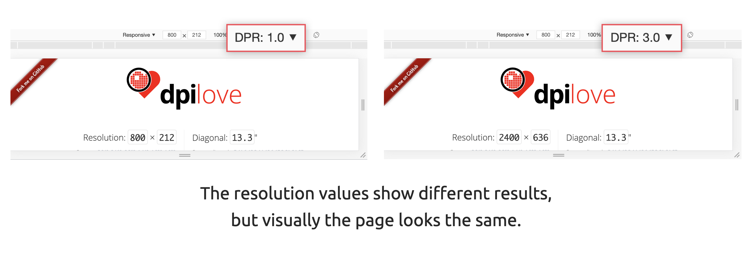
Developer tools offer ways to emulate lower DPR (device pixel ratio), and tools such as dpilove indeed show different resolution values after adjusting the DPR. However, the website still looks sharp and crisp on my MacBook. I wonder if I'm missing something here?
After reading Chris' post, I learned that you can enable low-resolution mode when developing on a high-resolution Mac. Open the app information for your browser, tick the box for "Open in Low Resolution" and start the application.

When you then open the app (my example shows Chrome Canary), you see a clear visual difference. The website is rendered in low resolution, everything is a bit "blurry", and even the browser frame and controls are not rendered in sharp retina style anymore.
That's good to know for future debugging sessions that deal with device pixel ratio!

Join 6.5k readers and learn something new every week with Web Weekly.

Frontend nerd with over ten years of experience, freelance dev, "Today I Learned" blogger, conference speaker, and Open Source maintainer.