How to preload responsive images with imagesizes and imagesrcset
- Published at
- Updated at
- Reading time
- 3min
Today I read Addy Osmani's article Preload late-discovered Hero images faster. It's a good summary of ways to preload resources if you want to adjust and improve the browser's loading behavior. The cool thing about this article; I discovered a recently added web platform feature to help speed up the loading of responsive images.
Let's assume you have the following responsive image in your page.
<img srcset="image-400.jpg 400w, image-800.jpg 800w, image-1600.jpg 1600w"
     sizes="100vw"
     alt="...">
The image's srcset and sizes attribute provide browsers with the information that a) it will span over the whole viewport width (100vw) and b) it is available in three sizes ranging from 400px to 1600px. Browsers can then load the best-suited image with this information without wasting high-res image data on tiny screens.
But you have to consider that browsers load resources in a particular order. They usually request images after critical resources like stylesheets and fonts. To change this loading order and re-prioritize resources, you can use <link rel="preload"> elements in your document's head to signal that specific resources are high-priority and should be requested, because they'll be needed soon.
<!-- preload a font that will be discovered later -->
<link rel="preload"
      href="fonts/cicle_fina-webfont.woff2"
      as="font"
      type="font/woff2"
      crossorigin>
If you want to learn more about preloading, look at the article Preload: What Is It Good For?.
But how would you preload a responsive image with sizes and srcset attributes?
It turns out that iamgesrcset and imagesizes made it into the spec. Use these attributes on link elements to give browsers the information of high-priority responsive images coming with sizes and srcset attributes.
<head>
  <!-- Hey browser!
       Please preload this important responsive image -->
  <link rel="preload"
        as="image"
        imagesrcset="
          image-400.jpg 400w,
          image-800.jpg 800w,
          image-1600.jpg 1600w"
        imagesizes="100vw">
</head>
<body>
  <img srcset="
         image-400.jpg 400w,
         image-800.jpg 800w,
         image-1600.jpg 1600w"
       sizes="100vw"
       alt="...">
</body>
imagesrcset and imagesizes follow the same rules as srcset and sizes on img elements so that you can reuse the same attribute values you use for the image itself.
Things to consider when using imagesrcset and imagesizes on link elements
imagesizes and imagesrcset only work on link elements with the attributes rel="preload" and as="image". Also, make sure to omit the href on the link element so that unsupporting browsers won't request a useless image.
Browser support
If you look at the browser support of responsive image preloading, you'll see that it's relatively green, and only Safari is missing.
 |  |  |  |  |  |  |  |  |
| 73 | 73 | 79 | 78 | 78 | 17.2 | 17.2 | 11.0 | 73 |
| | | | | | | | |
| 73 | 73 | 79 | 78 | 78 | 17.2 | 17.2 | 11.0 | 73 |
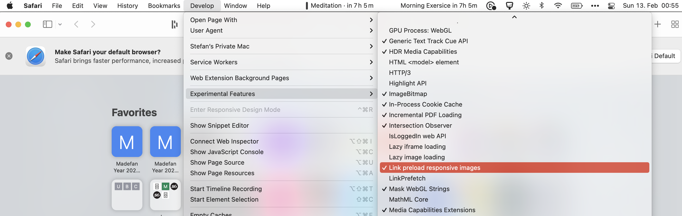
But and even though it's not reflected in the MDN compatibility data. Preloading of responsive images landed in Webkit already. I don't know when it landed, but when I check Safari 15 I can enable the feature in the "Experimental features" section. 👏
That's great news! Let's see when this feature lands in the Safari Tech Preview. Happy preloading!
Yes? Cool! You might want to check out Web Weekly for more quick learnings. The last edition went out 6 days ago.

Frontend nerd with over ten years of experience, freelance dev, "Today I Learned" blogger, conference speaker, and Open Source maintainer.