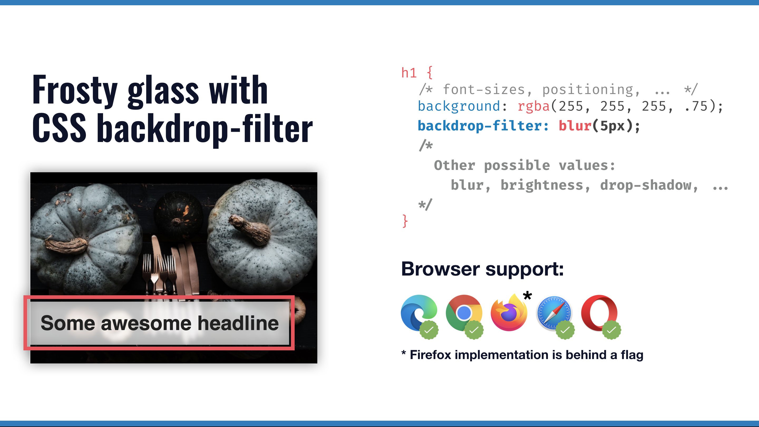
backdrop-filter lets you apply visual effects to the area behind an element
- Published at
- Updated at
- Reading time
- 2min
I was watching one of the Chrome Dev Summit Sessions with Adam Argyle and Una Kravets. They went into new CSS features coming to the web – there is fascinating stuff on the way. 🤯
Right at the beginning of the talk, they mention the new backdrop-filter CSS declaration, which I haven't heard of. Looking at the MDN page for it you'll find the following definition:
The backdrop-filter CSS property lets you apply graphical effects such as blurring or color shifting to the area behind an element. Because it applies to everything behind the element, to see the effect you must make the element or its background at least partially transparent.
I remember, years ago, when I started web development, I was trying to make a frosty glass effect possible (an element with a white background and blurred shine-through)...
This effect is now possible with one line of CSS. The CSS property is supported across recent major desktop browsers and has a global support of 80%. If you use backdrop-filter today make sure that you use it as enhancement to your site. Your site and its design should still work for the 20% not seeing fancy backdrop effects. :)
But still, years ago this was not possible, we live in a good web dev world these days!
You can play with it on CodePen.

Join 6.5k readers and learn something new every week with Web Weekly.

Frontend nerd with over ten years of experience, freelance dev, "Today I Learned" blogger, conference speaker, and Open Source maintainer.