aria-selected – when (not) to use it
- Published at
- Updated at
- Reading time
- 5min
Making websites accessible for everybody can be a really tough job, especially these days when we are going for custom markup solutions. I'm happy that the #a11y (short for accessibility) topic gains more and more interest recently, because #a11y is nothing nice to have, but as James Williamson tweeted today:
The biggest misconception about accessibility is that by adding it you're doing somebody a favor. You're not, you're doing your job.
To make your website more accessible you can use WAI-ARIA to provide more semantic information to allow assistive technologies.
The idea behind WAI-ARIA is great, but unfortunately using it can be harder than you might guess. Recently I came across an example for a pagination component and I saw a common mistake included which I want to discuss in detail with this article.
So let's have a look at the following example:
<nav role="navigation" aria-label="Pagination Navigation">
  <ul>
    <li>
      <a href="/page-1" aria-label="Go to Page 1">1</a>
    </li>
    <li>
      <a href="/page-2" aria-label="Current Page, Page 2"
         aria-selected="true">2</a>
    </li>
    <li>
      <a href="/page-3" aria-label="Go to Page 3">3</a>
    </li>
  </ul>
</nav>
A lot of elements in this example are labeled appropriately with aria-label attributes. This is a good thing, because a link which includes only the text of a number does not give a lot of information to blind users. For them it can be hard to understand the meaning of links full of numbers.
It's the second link I want to analyze more. It has an aria-selected set to true. This is one of the pitfalls of ARIA – it can be easily done wrong. Using it seems to make sense when you want to mark the current page as selected, but actually that's not correct and it doesn't have any influence on screenreaders like e.g. VoiceOver.
To understand why this is wrong we have to understand the concept of roles in ARIA.
The WAI-ARIA roles model is a way to give assistive technologies information about how to handle given elements.
In our case we're dealing with an anchor element which browsers automatically associate the role "link" with. Standard HTML elements usually have a proper role association. Browsers know what these elements mean and can treat them in the best and most accessible way.
Standard HTML elements will be rendered including proper focus handling, reaction to keyboard and click interactions.
Standard markup is accessible by default.
So let's have a look at the definition for the role "link":
An interactive reference to an internal or external resource that, when activated, causes the user agent to navigate to that resource.
There is probably nothing new for you in this definition, but right next to it you'll find information about supported states and properties, which are usually set via HTML attributes.
Using these you can provide additional information to assistive technology. The definition for "link" lists a bunch of ARIA attributes you can use like aria-label, aria-hidden or aria-disabled.
aria-selected is not in this list.
So what is the correct use case for it then? Let's have a look at its spec.
The definition of aria-selected includes:
This attribute is used with single-selection and multiple-selection widgets.
So to use aria-selected there has to be some selection involved.
Select elements and radio buttons are the first elements coming to my mind when dealing with selections. Links on the other hand don't provide any select interaction.
The fact that several links are included in a "pagination component" doesn't matter in this case. When you click on one of the links you usually load the next page and that's it. There is no actual select interaction coming with the pagination.
aria-selected is supported for several roles including the role "tab", which might be new for you, but I bet you know what to expect from it. If you look at this example youl see the usage of "tab" and the exact reasoning behind aria-selected.
<ul class="tablist" role="tablist">
  <li id="tab1" class="tab" aria-controls="panel1"
      aria-selected="true" role="tab" tabindex="0">Prices</li>
  <li id="tab2" class="tab" aria-controls="panel2"
      role="tab" aria-selected="false" tabindex="0">Features</li>
</ul>
The example shows a "tab component" which consists of several list items, that control the visible content. The list itself has the role "tablist" and each list item has the role "tab" to make sure assistive technology knows what to deal with.
The list items are focusable and react to clicks and keyboard navigation. This is done via tabindex and a bit of JavaScript. This component is overall really accessible and to provide the user with the additional information of which tab is currently selected the aria-selected attribute is toggled on every tab switch. Screenreaders are now able to read out "selected" because they understand this attribute for elements with the role "tab".
There is a lot more going on which I'm not going into detail (and you'll find explanations in the example), but building accessible tabs is not as trivial as it looks on first sight.
The most important thing to remember is, that aria-selected provides additional information about a selection interaction like the current tab in this case.
As you see dealing with WAI-ARIA is tricky, but thankfully there are ways to deal with this. For example Google provides a really nice Chrome extension that can help you to spot errors like this. To check your site you can easily run an accessibility audit in the developer tools against your site.
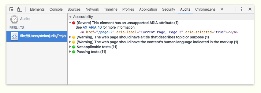
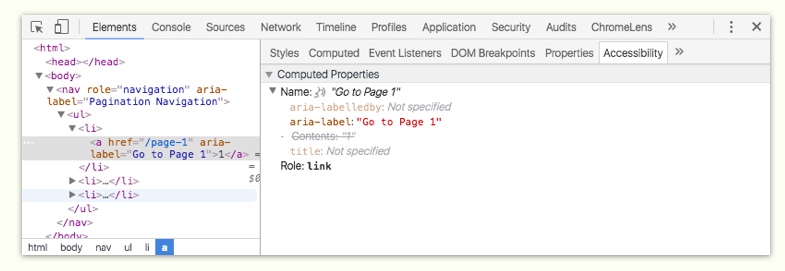
Additionally to the accessibility audit this extension also extends the element inspection with an accessibility panel. There you can have a look at the applied attributes and roles and also see what assistive technology would read out loud for this element. That's really handy and I actually use this a lot.
Dealing with accessibility is hard, but the WAI-ARIA specs are good to read and with proper tooling in place we all can make the web a more accessible place.
I hope you enjoyed this article, let me know if you have any comments and have a look at more accessibility resources on this blog.
Edit
It turns out the correct attribute for the use case of the current page in a pagination is the in WAI ARIA 1.1 defined aria-current attribute. Unfortunately it's not well supported at the time of writing.

Join 6.5k readers and learn something new every week with Web Weekly.

Frontend nerd with over ten years of experience, freelance dev, "Today I Learned" blogger, conference speaker, and Open Source maintainer.
Related Topics
Related Articles
- Notes on relying on the ARIA Authoring Practices Guide
- ARIA roles can remove their children’s semantics
- Header & footer elements change their roles when they're inside of sectioning content
- WCAG success criteria that can't be autmatically tested
- A "section" without an accessible name is nothing but a "div"