overflow hidden only hides elements going over the padding-box
- Published at
- Updated at
- Reading time
- 2min
I love smart CSS tricks! Today, I read "Restricting a (pseudo) element to its parent’s border-box" written by Ana Tudor. And while this article includes all the CSS magic, you may know Ana for it, also brought up a tiny CSS detail I wasn't aware of.
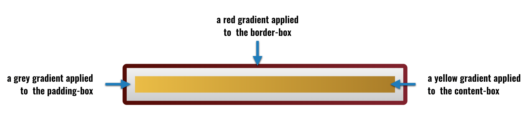
Before going into it, let's look into the CSS box-model for a minute. The CSS box-model defines several element areas and how they're laid out. There are the content-box, padding-box, and border-box and you can look at them in your developer tools of choice.

It's essential to know about the box-model when you want to lay out a website. But it's critical to understand when you want to create advanced CSS backgrounds like Ana describes in her article.
Thanks to the three box-model areas, you can apply three different CSS backgrounds to the same element without adding additional markup.
The following CSS...
.someManyGradients {
  // more stuff
  background:
    linear-gradient(90deg, #F2BC1B, #B27C00) content-box,
    linear-gradient(#f1f1f1, #ccc) padding-box,
    linear-gradient(-90deg, #8C142A, #5C0000) border-box;
}
... lets you style single elements with several gradients. 🎉
If you want to learn more about this technique, you can also have a look at this article in which I explain a specific element on CSSTricks this in detail.
But what happens when you have elements that overflow (let's say with absolute positioning) and you want to make them fit right into the pretty gradient-element?
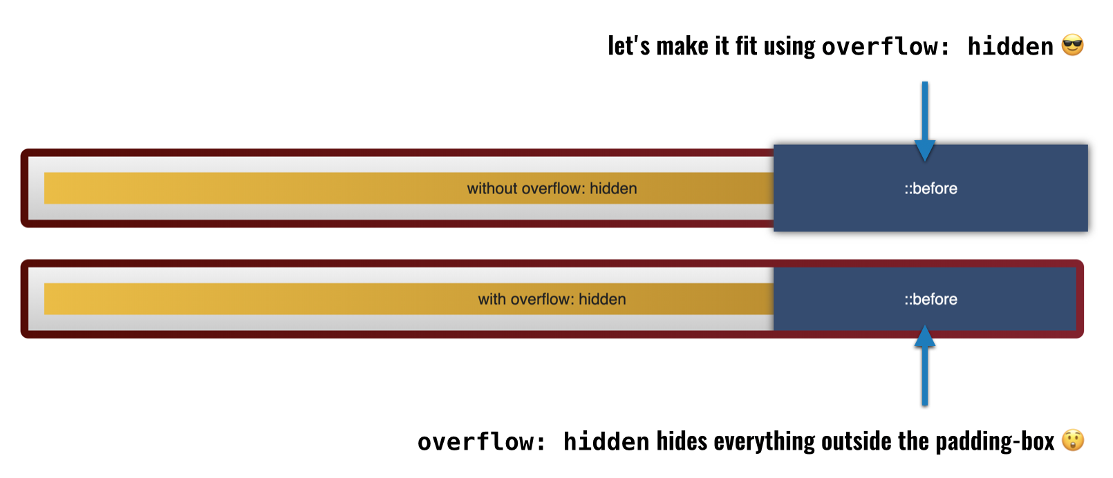
It turns out that the flowing element can not going over the red border. The CSS Overflow spec defines this behavior:
This value indicates that the box’s content is clipped to its padding box [...]
This is very surprising because I expected that the inner element would cover the red border-box, too.
If you want to learn how to come around this behavior, have a look at Ana's article or if you want to play around with the included example element you can find it on CodePen.

Join 6.5k readers and learn something new every week with Web Weekly.

Frontend nerd with over ten years of experience, freelance dev, "Today I Learned" blogger, conference speaker, and Open Source maintainer.