box-decoration-break helps to define how elements should be rendered across lines
- Published at
- Updated at
- Reading time
- 1min
Previously, I needed to style link elements in a pretty or fancy way.
Styling links can be tricky because the elements span multiple lines and a potential line break messes with the styling.
For example, padding and border-radius are only applied to an element's beginning and end. This behavior is not always what you want if your element spans across several lines.
Today I learned that box-decoration-break defines how elements are rendered across pages, columns, and lines. It accepts two values: slice (the initial value) and clone.
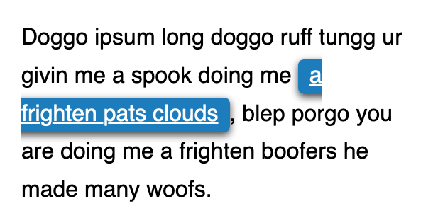
slice leads to "cut off" styles. In contrast, clone changes the rendering so every element fragment (an element spread across two lines includes two fragments) is rendered independently. Styles like padding are applied several times to all the element fragments. 🎉
box-decoration-break doesn't work for all CSS properties, though. The following properties are rendered independently:
backgroundborderborder-imagebox-shadowclip-pathmarginpadding
What's the browser support?
 |  |  |  |  |  |  |  |  |
| 130 | 130 | 130 | 32 | 32 | 7 | 7 | 28.0 | 130 |
With Chrome 130 being released October 2024, the browser support is pretty green and box-decoration-break is now a welcome help when dealing with fancy styles across lines and columns. 🎉
Have fun playing with a small demo below.
Lorem Ipsum is simply dummy text of the printing and typesetting industry. Lorem Ipsum has been the industry's standard dummy text ever since the 1500s, when an unknown printer took a galley of type and scrambled it to make a type specimen book. It has survived not only five centuries, but also the leap into electronic typesetting,remaining essentially unchanged. It was popularised in the 1960s with the release of Letraset sheets containing Lorem Ipsum passages,and more recently with desktop publishing software like Aldus PageMaker including versions of Lorem Ipsum.

Join 6.5k readers and learn something new every week with Web Weekly.

Frontend nerd with over ten years of experience, freelance dev, "Today I Learned" blogger, conference speaker, and Open Source maintainer.