Different background animations on mouseenter and leave
- Published at
- Updated at
- Reading time
- 2min
I'm a sucker for beautiful interactions. When you're browsing Codepen, you'll find countless examples of people going wild adding fancy effects to elements:
And as much as I like that stuff, I'm hesitant to throw JavaScript onto something tiny like a hover link animation. And additionally, the options to transition an element purely with CSS are limited. Let's take :hover as an example, there are not many possibilities with two available states (hovered or not hovered). You define a hover state and revert it when the interaction is over. That's it.
Today I found a super smart trick explained by Geoff Graham. Geoff explains how to transition an element's background using pseudo-elements. The catch: the colored background "transitions in" from one side and moves out at another. I haven't seen this effect with pure CSS before. 😲
HTML
CSS
How does that work? The trick is to define a different transform-origin. This is a super smart solution, and if you want to learn more, head over to CSS-Tricks to read Geoff's article.
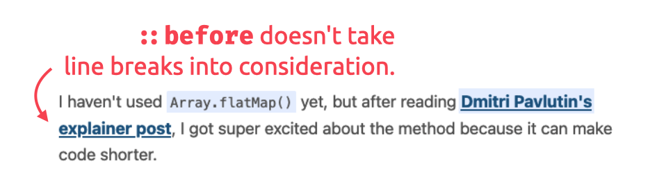
As a quick side note: if you're planning to apply this effect to links in paragraphs, be aware that the used ::before pseudo-element won't span over line breaks.
This behavior is not a dealbreaker, but yeah... it's why I didn't apply this fancy effect to all my links. 🤷♂️

Join 6.5k readers and learn something new every week with Web Weekly.

Frontend nerd with over ten years of experience, freelance dev, "Today I Learned" blogger, conference speaker, and Open Source maintainer.