Order in CSS transformations – transform functions vs individual transforms
- Published at
- Updated at
- Reading time
- 3min
With Webkit announcing their upcoming support for the rotate, translate and scale CSS properties, individual transform properties are on their way into browsers. The new CSS properties allow you to untangle all your transform CSS properties.
The new properties are supported in stable Firefox and Safari. And they'll enter Chrome 104 (view Chrome Status entry for independent CSS transform properties).
If you want to use rotate, translate and scale today, you have to rely on feature detection in your CSS code.
@supports (translate: 0) {
  /* Use `translate` */
}

@supports not (translate: 0) {
  /* Use `transform: translate()` */
}
I can't wait to adopt the new properties, but before you jump into all your codebases and change all transform properties to their transform counterparts, hold on for a moment!
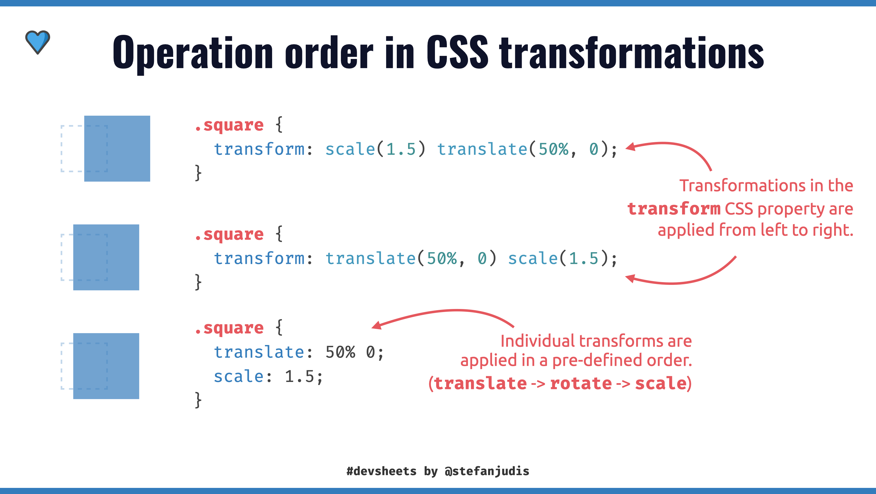
There is a fundamental difference between the two ways of transforming elements.
div {
  /*
    You define the order of operations!
    These transform functions are applied from left to right.
  */
  transform: translate(50%, 0) scale(1.5);
}

div {
  /*
    The order of operations is pre-defined!
    translate -> rotate -> scale
  */
  translate: 50% 0;
  scale: 1.5;
}
You can't "just" move all transformation functions to transformation properties because the order of transformation functions (scale(), rotate(), translate()) in a transform property matters.
Look at the "Rendering Model" sections of the "CSS Transforms Module Level 1" spec and see that transform functions (translate(), rotate(), etc.) are applied from left to right.
Multiply by each of the transform functions in transform property from left to right.
This fact can be surprising because the same applied transformation functions can lead to different visual effects depending on their order.
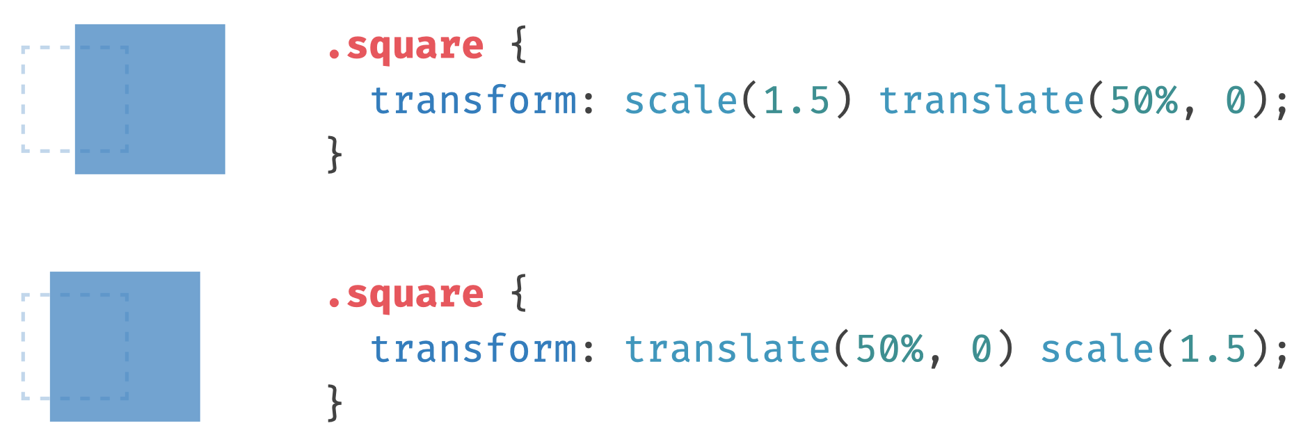
The above example shows that using translate(50%, 0) leads to different results when paired with the scale() function.
Contrary to transformation functions, individual transforms follow a pre-defined order. translate is applied first, followed by rotate and scale.
The different order in transformation functions and properties, can lead to different visual results even though the same transformations are applied.
.square {
  /* scale -> translate */
  transform: scale(1.5) translate(50%, 0);
}

.square {
  /* translate -> scale */
  translate: 50% 0;
  scale: 1.5;
}
Be careful when you adopt individual CSS properties; you can not just go ahead and change all transform functions to their variants because order matters when using CSS transforms.
I'm excited about the web platform moving to rotate, scale and translate. Once these properties are cross-browser supported, I'll migrate all my transformations over because individual transforms are more predictable and allow property-dependent animations, too.
If you want to play around with the new individual transform properties, open this CodePen in Firefox, Chrome Canary or the upcoming Safari Tech preview.

Join 6.5k readers and learn something new every week with Web Weekly.

Frontend nerd with over ten years of experience, freelance dev, "Today I Learned" blogger, conference speaker, and Open Source maintainer.