SVGs filters can be inlined in CSS
- Published at
- Updated at
- Reading time
- 4min
The CSS filter property provides a way to apply graphical effects on HTML elements. These effects go from blur to grayscale handling but can also include advanced filters using SVG. CSS filters are cross-browser supported and ready to use. If you haven't played around with them, you should give them a try!
Let's look at the CSS filter property, or feel free to jump to today's learning showing how to inline SVG filters in CSS.
Making complex SVG filters work in Safari turned out to be a challenge (sometimes they fail to display without showing an error). I recommend treating advanced filters as a progressive enhancement.
To apply visual effects, you can define two different value types for the CSS filter property: filter functions and SVG filters.
How to apply filter functions in CSS
There are ten different filter functions:
blurbrightnesscontrastdrop-shadowgrayscalehue-rotateinvertopacitysaturatesepia
See and play around with these filters do below.
Filter functions are composable. You can define multiple filter functions in a single filter declaration to create effects like the following. Look at this purple beauty that combines the hue-rotate and drop-shadow filter functions. 👇
But what if you want to apply visual effects that are not covered by these functions?
How to apply SVG filters in CSS
Additionally to the available filter functions, you can define "more advanced" filters in SVG. SVG filters are powerful. Let's have a look at an example to see SVG filters in action.
SVG provides filter elements that can include filter primitives such as the feGaussianBlur element. If these filter elements include an id attribute, they can be referenced and applied to other elements. In this case, the rect element references the #blur filter element to apply a basic blur effect.
I'm not going into the details of creating SVG filters in this article, but if you want to see what's possible with the filter element, I can recommend checking out yoksel.github.io/svg-filters/. The online editor does a great job showing what's possible with SVG filters, and it includes many effects that are more exciting than a blur.
I'm always impressed when I see what's possible with SVG filters.
Apply external SVG filters
Applying an SVG filter to other SVG elements is useful, but it gets exciting when you leave SVG's borders and apply filters to HTML elements via CSS!
To use an SVG filter in CSS, use the url keyword, define a URI that defines an SVG file, and reference a filter with an id. That's it!
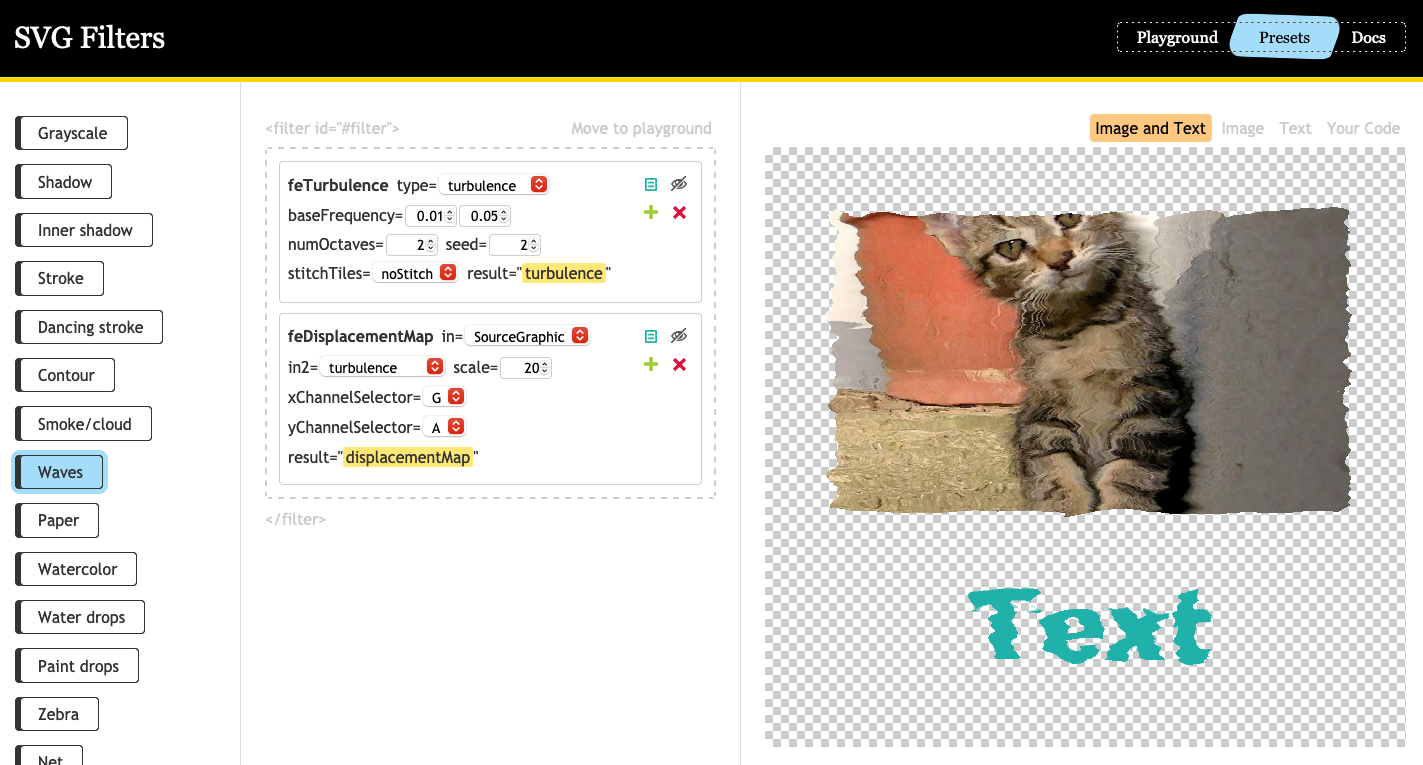
The waves filter you see above is a modified version of the presets included at yoksel.github.io/svg-filters/.
The waves effect shows the power of SVG filters. I'm amazed to see the wavey image and headline.
Apply embedded/inlined SVG filters
If you don't want to load external SVG files, you can also inline the SVG in your HTML and reference the filter in your CSS.
Be careful with this approach: it seems like Firefox is not applying inlined SVG filters that are set to display: none (bug report).
While reading Mathias' article Simulating color vision deficiencies in the Blink Renderer, I learned a nifty trick about SVG filters.
If you don't want to load an external SVG and dislike to inline SVG in your HTML, you can inline your SVG filter in CSS!
This trick is beautiful because you can define SVG filters where you use them. Thanks for sharing this trick, Mathias!
PS. Before deploying complex SVG filters to all your elements, make sure to do "real cross-browser testing". I saw that especially Safari fails to display complex SVG filters.
I tested the included examples in Firefox 84 and and Chrome 87. It worked in Safari 14 but stopped for unknown reason. 🙈
If things don't work for you have a look at the following bug tickets (I'm expecting more to come up over time):
Join 6.1k readers and learn something new every week with Web Weekly.

