An SVG filter to pixelate images
Written by Stefan Judis
- Published at
- Updated at
- Reading time
- 1min
This post is a quick one for my bookmarks. Taylor Hunt published this "pixelate SVG filter" on CodePen. I didn't get into understanding how it exactly works, but it might come in handy some day.
<svg>
  <filter id="pixelate" x="0" y="0">
    <feFlood x="4" y="4" height="2" width="2"/>
    <feComposite width="10" height="10"/>
    <feTile result="a"/>
    <feComposite in="SourceGraphic" in2="a" operator="in"/>
    <feMorphology operator="dilate" radius="5"/>
  </filter>

  <image width="100%" height="100%"
         preserveAspectRatio="xMidYMid slice"
         filter="url(#pixelate)"
         xlink:href="https://s3-us-west-2.amazonaws.com/s.cdpn.io/183091/grateful_dog.jpg"/>
  <image width="100%" height="100%"
         preserveAspectRatio="xMidYMid slice"
         clip-path="url(#half)"
         xlink:href="https://s3-us-west-2.amazonaws.com/s.cdpn.io/183091/grateful_dog.jpg"/>
  <clipPath id="half">
    <rect width="100%" height="50%"/>
  </clipPath>
</svg>
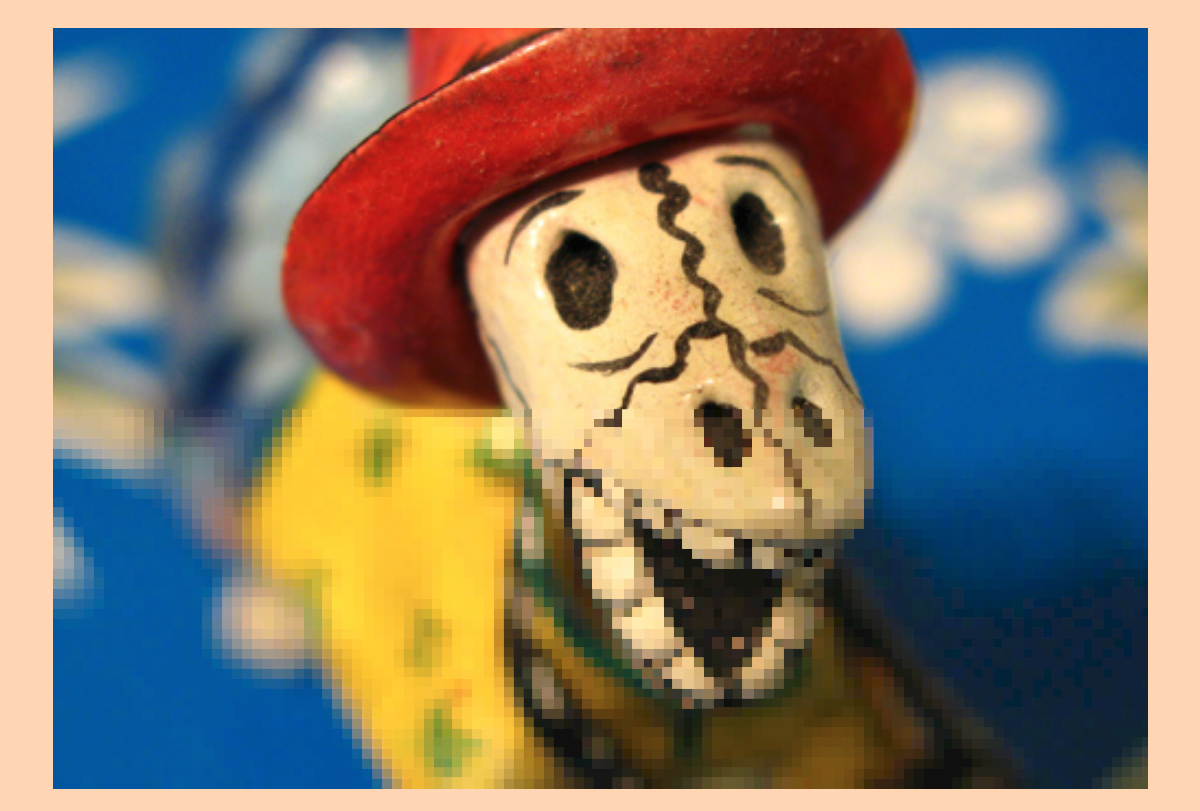
And this code renders like that. 😲
Ryan shared that the effect works as an inline SVG/CSS filter. After quickly testing it, it only seems to work in Firefox, though.
It's fascinating what SVG filters can do. Maybe I'll properly learn all these SVG filters one day.

If you enjoyed this article...
Join 6.5k readers and learn something new every week with Web Weekly.
Reply to this post and share your thoughts via good old email.

Frontend nerd with over ten years of experience, freelance dev, "Today I Learned" blogger, conference speaker, and Open Source maintainer.