Conditional border-radius and three future CSS features
- Published at
- Updated at
- Reading time
- 4min
Ahmad Shadeed's post Conditional Border Radius In CSS is a wonderful example of CSS trickery that explains a fairly cryptic CSS snippet found on facebook.com.
.conditional-border-radius {
   border-radius: max(0px, min(8px, calc((100vw - 4px - 100%) * 9999)));
}
This snippet is quite hefty CSS, and if you want to learn how it works first, head over to read Ahmad's post. It's a good hack, but it is also unreadable. Even if you understand this border-radius declaration today, you have to write a lengthy comment so that your future self won't travel back in time to have a word with you.
If you describe the CSS' functionality in JavaScript, that's how it would look like.
if (cardWidth >= viewportWidth) {
  radius = 0;
} else {
  radius = 8px;
}
That's reasonable logic! It's readable and easy to understand. Can we have something like that in CSS? Maybe in the future?
The CSS code below is far away from being cross-browser supported, the specs are still edited, and it is not ready for production!
Let's start with a common media query and make our way from there.
@media (min-width: 600px) {
  .contitional-border-radius {
    border-radius: 1em;
  }
}
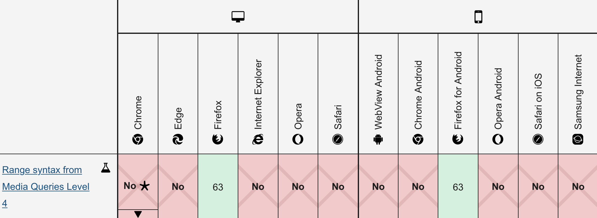
The pretty new media query range context make things less verbose and more readable.
@media(width >= 600px) {
  /* ... */
}

@media (400px < width < 1000px) {
  /* ... */
}
I'm a big fan of this syntax. Unfortunately, at the time of writing, only Firefox supports media query ranges.
On the bright side: you can use media query ranges today when PostCSS is embedded in your toolchain.
With media query ranges at our hands, what's next?
Let's bring in the new hotness – container queries. Container queries allow you to style a container's children depending on its width. I'm not going into the great technical details here, but you can find plenty of resources by googling container queries. Many people are writing about it right now.
Here's the syntax:
@container (width > 600px) {
  .conditional-border-radius {
    border-radius: 1em;
  }
}
And we're one step closer! width defines the query container's content box width and according to the spec it can be compared to relative length units which include viewport units. Let's flip things around bring in the viewport width!
/* If the containers width is equal or greater than
   the viewport width, remove the border-radius */
@container (width >= 100vw) {
  .conditional-border-radius {
    border-radius: 0;
  }
}
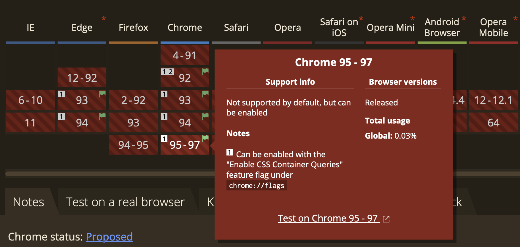
This CSS looks excellent, but it's also future music due to the current browser support. Container queries are pretty much a Chromium thing right now, they're in active development and only supported by toggling a feature flag.
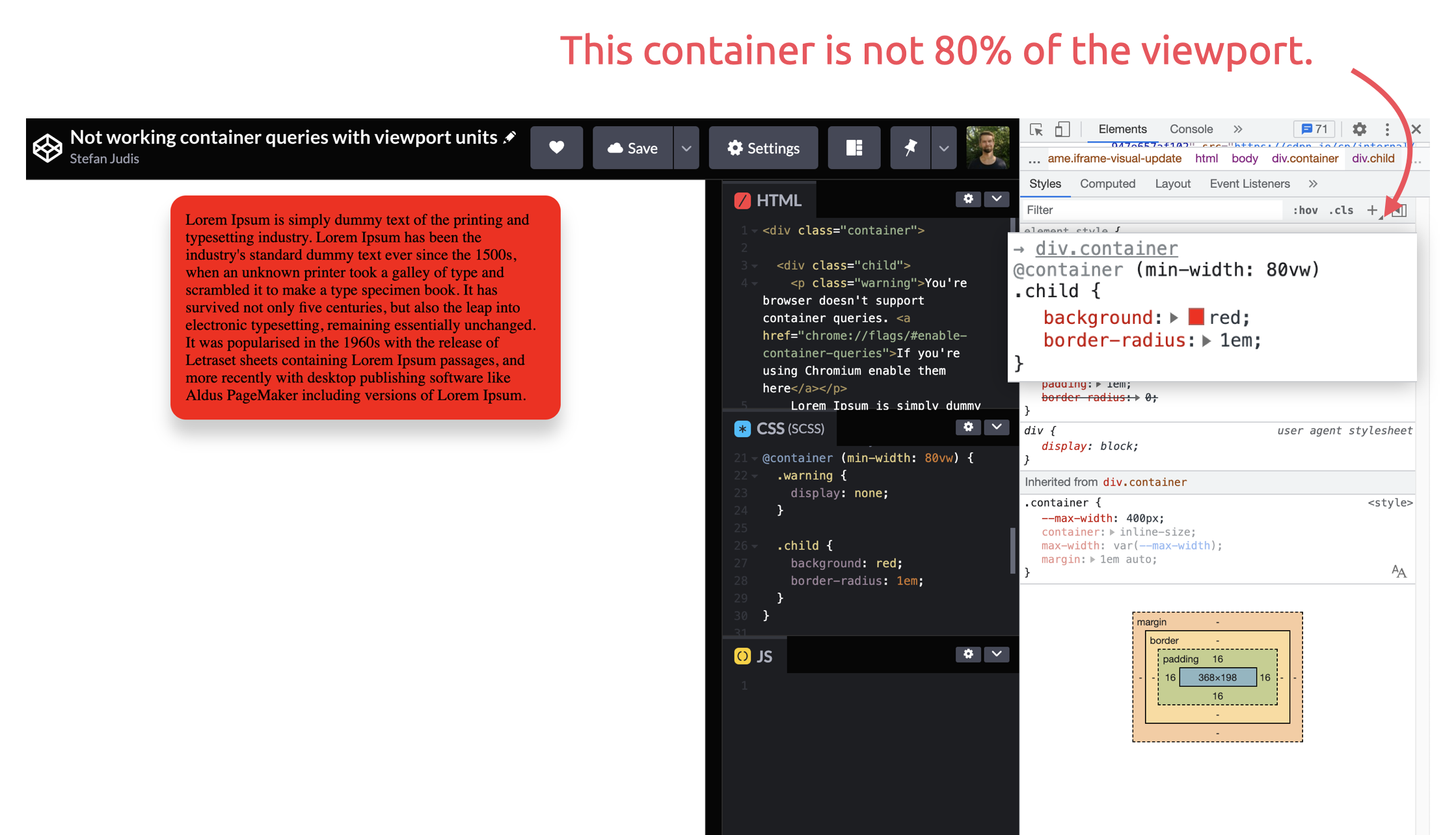
Unfortunately, it doesn't look like Chromium's experimental container query implementation supports viewport units yet (or am I using them wrong?). I created two CodePens to test things out. The one using pixel units works fine, whereas a container query using viewport units always matches.
But could we come even closer to a readable CSS snippet as we're looking at future implementations anyway?
Chris Coyier recently shared a very new CSS conditionals proposal. @when and @else are ready for spec work and adoption. 🎉
@when container(width >= 100vw) {
  .conditional-border-radius {
    border-radius: 0;
  }
}
@else {
  .conditional-border-radius {
    border-radius: 1em;
  }
}
There's not much to say about @when because no browser implements it, and it might take a while until we can use it. The spec doesn't mention @container either, but it's logical to me to include container queries, too.
At least theoretically, we arrived at a few readable CSS lines that render something depending on viewport and(!) container width.
@when container(width >= 100vw) {
  .conditional-border-radius {
    border-radius: 0;
  }
}
@else {
  .conditional-border-radius {
    border-radius: 1em;
  }
}
In case you want to have a look, here are the specs again:
It's fantastic to see how CSS evolves, and I can't wait until browsers implement all this greatness. The future is bright, friends!
Join 6.5k readers and learn something new every week with Web Weekly.

Frontend nerd with over ten years of experience, freelance dev, "Today I Learned" blogger, conference speaker, and Open Source maintainer.