Should responsive images work with container queries?
- Published at
- Updated at
- Reading time
- 5min
Container queries are slowly moving towards cross-browser support, and it got me wondering: how is image loading supposed to work in a container-based world?
The wonderful Miriam Suzanne pointed me to a GitHub issue discussing this exact topic.
Here's the issue created by Una Kravets.

srcset and sizes interaction with container queries una opened it Jan 22 2021
As it's pretty long, and the topic spreads across multiple different but somehow related discussions, let me summarize what I understood.
Disclaimer: I'm no browser engineer; if you spot any mistakes, please let me know!
The syntax for responsive images is quite verbose. And especially if you want to load different image formats, it becomes a maintenance nightmare quickly. But let's ignore all that.
What could a potential syntax look like? Una proposes the following.
<!-- This is just a propoasl -->
<img srcset="elva-fairy-480w.jpg 480w,
             elva-fairy-800w.jpg 800w"
     sizes="container(max-width: 600px) 480px,
            800px"
     src="elva-fairy-800w.jpg"
     alt="Elva dressed as a fairy">

<picture>
  <source container="(max-width: 799px)" srcset="elva-480w-close-portrait.jpg">
  <source container="(min-width: 800px)" srcset="elva-800w.jpg">
  <img src="elva-800w.jpg" alt="Chris standing up holding his daughter Elva">
</picture>
Adding a container function or attribute seems reasonable, but there's a breaker here — images are usually loaded before the layout happens. So there's no way to evaluate the parent container.
To understand why it's not just adding a new container keyword, we have to look at responsive images today.
<img
  srcset="elva-fairy-480w.jpg 480w, elva-fairy-800w.jpg 800w"
  sizes="(max-width: 600px) 480px,
         800px"
  src="elva-fairy-800w.jpg"
  alt="Elva dressed as a fairy" />
The srcset attribute defines the available image sizes, while the sizes attribute specifies how the image will be laid out.
When a browser loads a page, the preload scanner rushes ahead and tries to discover all resources to load them as quickly as possible. Most likely, CSS is still in flight when this happens. The sizes attribute gives a peak into how the image will be laid out once CSS is loaded so the best image can be requested.
Maintaining the sizes attribute has always been challenging because it duplicates layout information. sizes must match the applied CSS layout or you risk loading the wrong images.
I don't have numbers on this, but I expect multiple sites to load wrongly sized images because it's too hard to come up with a correct sizes definition and keep it in sync with changing CSS.
To change the image loading behavior and make it dependent on a parent container, browsers must finish the layout step first. And that's the real challenge here.
If you want to learn more, there's an issue discussing if loading="after-layout" would make sense.
But as it turns out, some images are already loaded after the layout step!
Lazy loaded images are loaded after layout
loading="lazy" changes when images are requested. And while it might seem obvious, it's an essential part of this discussion.
Conceptually, the browser can't know if an image is visible and lazy load it without doing layout. So, whenever you lazy load images, their loading will be delayed until the CSS arrives and layout finishes.
I tested this behavior, and Chrome and Safari indeed wait for CSS to be loaded before requesting a lazy loaded image.
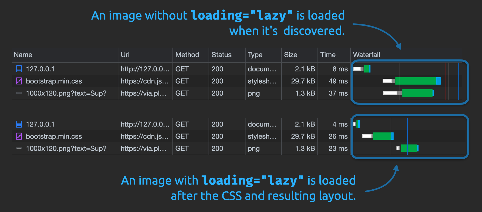
Firefox doesn't seem to care. 🤷♂️
This functionality leads to the fundamental question of whether we need the sizes attribute in general.
sizes is supposed to give the browser early layout information to load images as quickly as possible. But if loading is delayed and happens after layout anyways, why do I have to be bothered with typing up this info for every image?
Can we cut out the human factor and let the browser pick the right image because it has all the necessary info?
sizes="auto" — a path to container-based responsive images
Simon Pieters (Mozilla) thought the same and opened a spec change to introduce sizes="auto". And guess what? All three engines agree that letting the browser load the best sized image by itself is good idea. And the HTML addition slowly starts to land. sizes="auto" will become part of the web platform! 🎉
 |  |  |  |  |  |  |  |  |
| 126 | 126 | 126 | 150 | 150 | Nein | Nein | 28.0 | 126 |
Do we still need a syntax for container-based image loading then?
The browser would have all the necessary information to load the correct image, whether it's lazy loaded or inside a container query.
As always: it's all about trade-offs.
Is the best solution to load an image as quickly as possible before layout and accept the challenging authoring experience and possible mistakes?
Or should we just delay the image loading, eliminate all the mistakes and load the best images after layout?
There's no right or wrong answer here. It's the usual "it depends".
The only thing I can say is that I'm not the only one struggling with writing a correct sizes definition, and if browsers could take this work off my shoulders, I'm all for it!
The work people take to spec a new platform feature is astonishing! The web platform is a complex beast where countless things must be considered. So, kudos to all of you working on this stuff! 👏
There will be many more discussions regarding container-based responsive images, and it will take some time until they land or we'll have a working solution. Don't keep your hopes high of using them soon.
But that's just how it is; evolving the web takes time...
If you want to subscribe to some issues and follow along, here they are:

Join 6.5k readers and learn something new every week with Web Weekly.

Frontend nerd with over ten years of experience, freelance dev, "Today I Learned" blogger, conference speaker, and Open Source maintainer.