Too small touch targets
- Published at
- Updated at
- Reading time
- 2min
Here's an interesting UI pattern from GitHub.👇

I'm no big GitHub mobile user, but occasionally, I browse projects while on the go. With the fat finger problem, navigating complex sites can be a pain. And the same goes for GitHub. The account owner and repository home link are super close to each other in the header. Just by looking at them, every mobile user knows that hitting the right target requires surgical tap precision.
What does GitHub do about these tiny and too-close-to-each-other links? Change the design? Obviously not. They change the UI functionality entirely and put the account owner and repository into a button.
The button then opens a modal that asks where you want to go. Smart.
What's a good target size, though?
The freshly released Web Content Accessibility Guidelines (WCAG) recommend 24 by 24 CSS pixels in the "Target Size" minimal success criterion (AA). For the enhanced one (AAA), it's even 44 by 44 CSS pixels. And when you inspect the GitHub header, neither of the elements passed these requirements.

How many links fulfill these on GitHub? Steve Faulkner has a handy bookmarklet to check for accessible tap targets. It highlights elements too small to be reliably tapped (the blue circles).

Big enough touch elements seem like an obvious check to include in Lighthouse, too. But you won't find tap target checks in the "Accessibility" section. They're checked in the "Mobile friendly" SEO section.
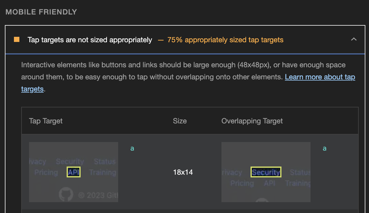
And funnily, the mobile friendly tap target SEO checks evaluate elements for a minimum size of 48 by 48 CSS pixels, which doesn't reflect the WCAG guidelines.
Currently, the tap targets check is implemented in Lighthouse itself, but there are discussions to replace it with Axe's tap target check. This change should align it with the 44 by 44 tap target. Lighthouse includes the Axe library anyway, so this seems like a reasonable apporach.
But I keep thinking that browsers should adopt GitHub's behavior natively. "Hey Stefan, your fat finger hit two targets. Which one did you want to click?" — seems reasonable. I'm game! What do you think?

Join 6.5k readers and learn something new every week with Web Weekly.

Frontend nerd with over ten years of experience, freelance dev, "Today I Learned" blogger, conference speaker, and Open Source maintainer.
Related Topics
Related Articles
- Notes on relying on the ARIA Authoring Practices Guide
- ARIA roles can remove their children’s semantics
- Header & footer elements change their roles when they're inside of sectioning content
- WCAG success criteria that can't be autmatically tested
- A "section" without an accessible name is nothing but a "div"